Chart Components
The Reeflow SDK provides three chart components for visualizing data: bar charts, line charts, and pie charts. All charts provide high-performance, interactive visualizations.
Choosing the right chart
Section titled “Choosing the right chart”Each chart type is designed for specific data visualization needs:
| Chart Type | Best For | When to Use | Example Use Cases |
|---|---|---|---|
| Bar Chart | Comparing categories | Discrete categories, rankings, comparisons | Sales by product, revenue by region, top performers |
| Line Chart | Showing trends over time | Time-series data, continuous data, trends | Monthly revenue, website traffic, stock prices |
| Pie Chart | Showing composition | Parts of a whole, percentages, distribution | Market share, budget breakdown, category distribution |
Common features
Section titled “Common features”All chart components share these features:
- JSONQL queries: Define data queries using JSONQL
- Loading states: Automatic skeleton loaders while data loads
- Error handling: Clear error messages with retry functionality
- Empty states: Graceful handling of empty datasets
- Theming: Automatic theme inheritance from Provider
- Interactive: Built-in tooltips, legends, and interactions
- Responsive: Automatically resize with container
Bar Chart
Section titled “Bar Chart”The <reeflow-bar-chart> component displays categorical data with rectangular bars.
When to use
Section titled “When to use”Purpose: Compare values across different categories
Bar charts display data using rectangular bars where the length of each bar is proportional to the value it represents. They excel at making comparisons between discrete categories immediately visible.
Best for:
- Comparing values across categories (products, regions, teams)
- Ranking items (top 10 products, best performing regions)
- Showing multiple metrics side-by-side (revenue vs. profit)
Avoid when: You need to show trends over time (use line chart) or proportions of a whole (use pie chart)
Basic usage
Section titled “Basic usage”import { ReeflowProvider, ReeflowBarChart } from '@reeflow/react';
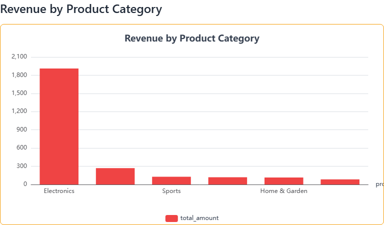
<ReeflowProvider authToken="your-token"> <ReeflowBarChart title="Sales by Product" query={{ from: 'orders', dimensions: ['product_name'], measures: [{ column: 'revenue', type: 'sum' }], }} /></ReeflowProvider>;<reeflow-provider auth-token="your-token"> <reeflow-bar-chart title="Sales by Product"> <script type="application/json" slot="query"> { "from": "orders", "dimensions": ["product_name"], "measures": [ { "column": "revenue", "type": "sum" } ] } </script> </reeflow-bar-chart></reeflow-provider>Grouped bars
Section titled “Grouped bars”You can display multiple measures as grouped bars:
import { ReeflowBarChart } from '@reeflow/react';
<ReeflowBarChart title="Revenue vs. Profit" query={{ from: 'orders', dimensions: ['product_category'], measures: [ { column: 'revenue', type: 'sum' }, { column: 'profit', type: 'sum' }, ], }}/>;<reeflow-bar-chart title="Revenue vs. Profit"> <script type="application/json" slot="query"> { "from": "orders", "dimensions": ["product_category"], "measures": [ { "column": "revenue", "type": "sum" }, { "column": "profit", "type": "sum" } ] } </script></reeflow-bar-chart>Attributes
Section titled “Attributes”| Attribute | Type | Default | Description |
|---|---|---|---|
title | string | - | Chart title displayed above the visualization |
width | number | container width | Width in pixels |
height | number | 400 | Height in pixels |
theme | string | inherited | Override provider theme |
theme-mode | string | inherited | Override provider theme mode (auto, light, dark) |
Line Chart
Section titled “Line Chart”The <reeflow-line-chart> component displays data as a series of points connected by lines, ideal for time-series and trend analysis.
When to use
Section titled “When to use”Purpose: Visualize trends and changes over time
Line charts connect data points with lines, making patterns and trends easy to identify. They’re particularly effective for time-series data where you want to see how values evolve.
Best for:
- Tracking metrics over time (daily sales, monthly growth)
- Showing trends and patterns (seasonal variations, growth trajectories)
- Comparing multiple time-series on the same timeline
Avoid when: Categories are not sequential or ordered, or when showing composition/distribution
Basic usage
Section titled “Basic usage”import { ReeflowLineChart } from '@reeflow/react';
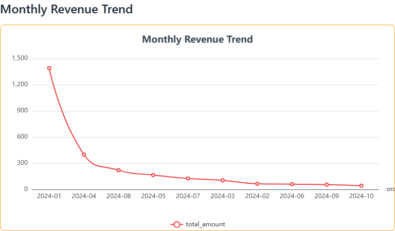
<ReeflowLineChart title="Revenue Over Time" query={{ from: 'orders', dimensions: [ { column: 'order_date', type: 'time', granularity: 'month', }, ], measures: [{ column: 'revenue', type: 'sum' }], }}/>;<reeflow-line-chart title="Revenue Over Time"> <script type="application/json" slot="query"> { "from": "orders", "dimensions": [ { "column": "order_date", "type": "time", "granularity": "month" } ], "measures": [ { "column": "revenue", "type": "sum" } ] } </script></reeflow-line-chart>Multiple series
Section titled “Multiple series”Display multiple lines on the same chart:
import { ReeflowLineChart } from '@reeflow/react';
<ReeflowLineChart title="Revenue vs. Costs" query={{ from: 'financials', dimensions: [ { column: 'date', type: 'time', granularity: 'week', }, ], measures: [ { column: 'revenue', type: 'sum' }, { column: 'costs', type: 'sum' }, ], }}/>;<reeflow-line-chart title="Revenue vs. Costs"> <script type="application/json" slot="query"> { "from": "financials", "dimensions": [ { "column": "date", "type": "time", "granularity": "week" } ], "measures": [ { "column": "revenue", "type": "sum" }, { "column": "costs", "type": "sum" } ] } </script></reeflow-line-chart>Attributes
Section titled “Attributes”| Attribute | Type | Default | Description |
|---|---|---|---|
title | string | - | Chart title displayed above the visualization |
width | number | container width | Width in pixels |
height | number | 400 | Height in pixels |
theme | string | inherited | Override provider theme |
theme-mode | string | inherited | Override provider theme mode (auto, light, dark) |
Pie Chart
Section titled “Pie Chart”The <reeflow-pie-chart> component displays data as proportional slices of a circle, ideal for showing composition.
When to use
Section titled “When to use”Purpose: Show how parts make up a whole
Pie charts divide a circle into proportional slices, making it easy to see how individual parts contribute to the total. Each slice represents a percentage of the whole.
Best for:
- Showing distribution or composition (market share, budget allocation)
- Displaying parts of a whole that sum to 100%
- Highlighting dominant categories in a dataset
Avoid when: You have more than 7-8 categories, need precise comparisons (use bar chart), or showing trends over time
Basic usage
Section titled “Basic usage”import { ReeflowPieChart } from '@reeflow/react';
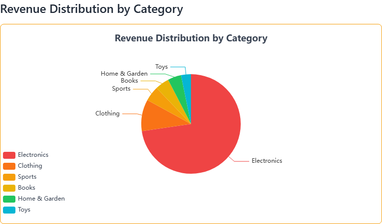
<ReeflowPieChart title="Market Share" query={{ from: 'sales', dimensions: ['product_category'], measures: [{ column: 'revenue', type: 'sum' }], }}/>;<reeflow-pie-chart title="Market Share"> <script type="application/json" slot="query"> { "from": "sales", "dimensions": ["product_category"], "measures": [ { "column": "revenue", "type": "sum" } ] } </script></reeflow-pie-chart>Attributes
Section titled “Attributes”| Attribute | Type | Default | Description |
|---|---|---|---|
title | string | - | Chart title displayed above the visualization |
width | number | container width | Width in pixels |
height | number | 400 | Height in pixels |
theme | string | inherited | Override provider theme |
theme-mode | string | inherited | Override provider theme mode (auto, light, dark) |
Common operations
Section titled “Common operations”Programmatic usage
Section titled “Programmatic usage”All chart components expose methods for programmatic interaction:
query- Get or set the JSONQL queryrefresh()- Reload data from the current querysetData()- Set data directly without a query
See the SDK Reference for detailed API documentation.
Events
Section titled “Events”All chart components emit lifecycle and interaction events.
Lifecycle events (all frameworks)
Section titled “Lifecycle events (all frameworks)”reeflow-state-change- Fired when component state changes (detail:{ state: ReeflowComponentState, oldState: ReeflowComponentState })reeflow-data-loaded- Data successfully loaded (detail: QueryResult)reeflow-error- Error occurred during loading (detail: ApiError with code, message, and optional details)
Interactive events (React only)
Section titled “Interactive events (React only)”All charts in React support interactive event handlers with automatic detail extraction:
import { ReeflowBarChart } from '@reeflow/react';
<ReeflowBarChart  query={query}  onChartClick={(detail) => {    console.log('Clicked:', detail.name, detail.value);  }}  onChartHover={(detail) => {    console.log('Hovering:', detail.name, detail.value);  }}  onChartLegendToggle={(detail) => {    console.log('Legend toggled:', detail.seriesName, detail.visible);  }}/>;
Available chart event handlers:
onChartClick- Fired when a chart element (bar, line point, pie slice) is clickedonChartHover- Fired when mouse hovers over a chart elementonChartLegendToggle- Fired when a legend item is clicked
Example with state:
import { ReeflowBarChart } from '@reeflow/react';import { useState } from 'react';
function InteractiveChart() {  const [selected, setSelected] = useState(null);
  return (    <div>      <ReeflowBarChart query={query} onChartClick={(detail) => setSelected(detail)} />
      {selected && (        <div className="selection-panel">          <h3>Selected: {selected.name}</h3>          <p>Value: {selected.value}</p>        </div>      )}    </div>  );}
In vanilla JavaScript, use the Web Components API to listen to events:
const chart = document.querySelector('reeflow-bar-chart');
chart.addEventListener('reeflow-chart-click', (event) => {  console.log('Clicked:', event.detail.name, event.detail.value);});
chart.addEventListener('reeflow-chart-hover', (event) => {  console.log('Hovering:', event.detail.name, event.detail.value);});
chart.addEventListener('reeflow-chart-legend-toggle', (event) => {  console.log('Legend toggled:', event.detail.seriesName, event.detail.visible);});
See the React Hooks documentation for more ways to handle component state and events.
Custom styling with CSS Parts
Section titled “Custom styling with CSS Parts”Charts expose CSS parts for custom styling. See the Theming documentation for details on styling with CSS Parts, and the CSS Parts Reference for a complete list of available parts.
Example:
reeflow-bar-chart::part(container) {  border: 1px solid #e0e0e0;  border-radius: 8px;  padding: 16px;}
reeflow-bar-chart::part(title) {  color: #333;  font-size: 18px;  font-weight: 600;}
Performance tips
Section titled “Performance tips”Optimize queries
Section titled “Optimize queries”- Use appropriate aggregations in your JSONQL queries
- Limit data with filters to reduce payload size
- Use time granularity wisely (day vs. hour vs. minute)